Boston Cream Mini Donuts — Packaging for Every Mood
Objective
To reimagine the packaging design for Boston Cream Mini Donuts and explore how visual style can reposition a single product for different audiences — from elegant indulgence to everyday simplicity and playful fun.
This project was created to demonstrate how packaging can flex across brand segments while maintaining consistency in tone, structure, and storytelling.
Creative Challenge
How can one product adapt to three distinct consumer mindsets — without losing its identity?
I set out to create three visual directions that each tell a story:
-
Elegant Indulgence: sophisticated and premium
-
Everyday Classic: clean and approachable
-
Playful Delight: colorful and family-friendly
Each design uses typography, color, and composition to evoke a different emotional response, showing how packaging can shift perception through design psychology.
Design Directions
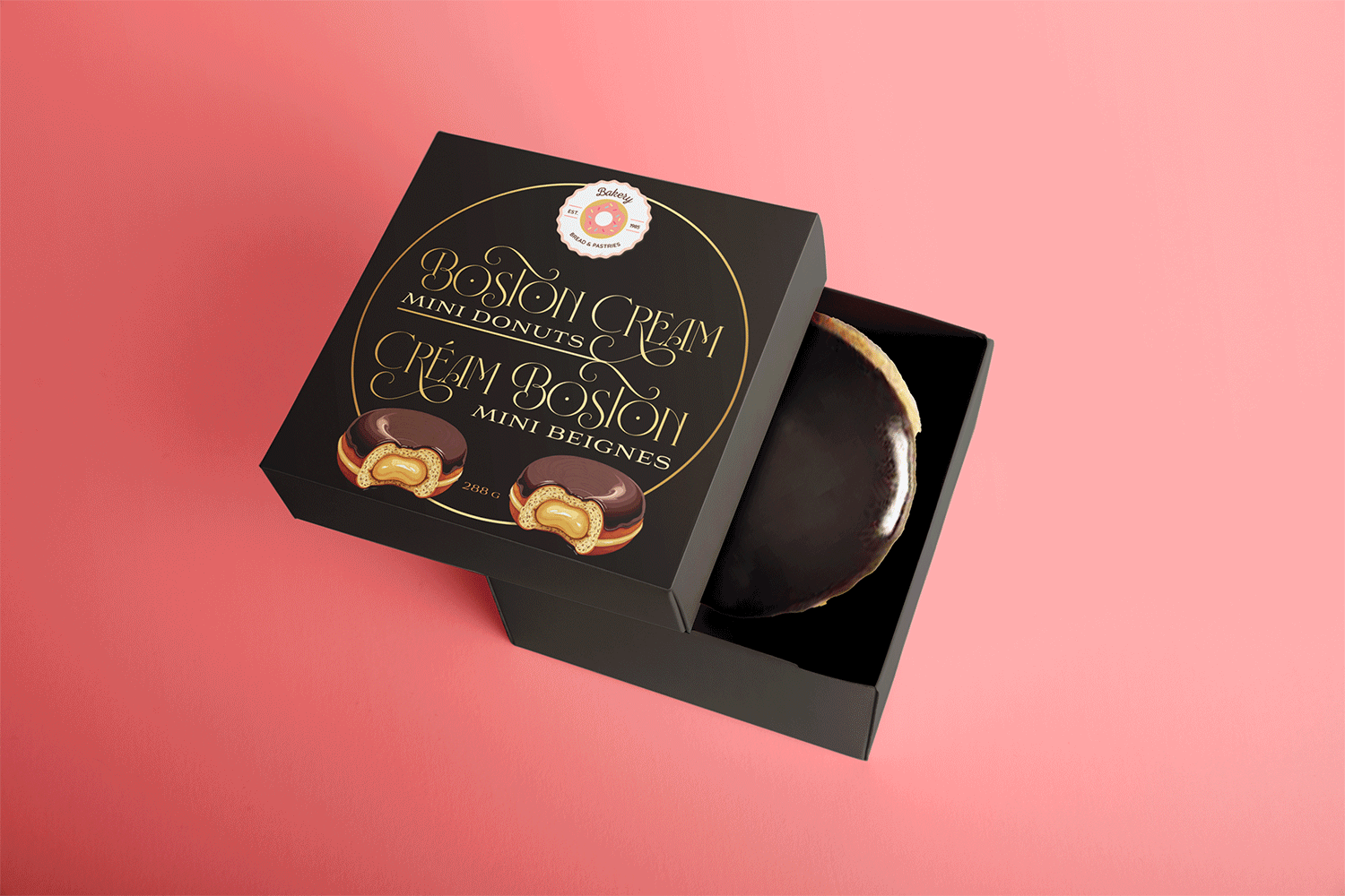
Elegant Indulgence
Audience: Boutique bakeries & premium dessert lines
Design Intent: Create a refined, high-end look that feels gift-worthy.
Visual Approach:
-
Deep black with gold typography for luxury contrast
-
Ornamental type and minimal imagery
-
Warm lighting and premium tone on a pink background for balance
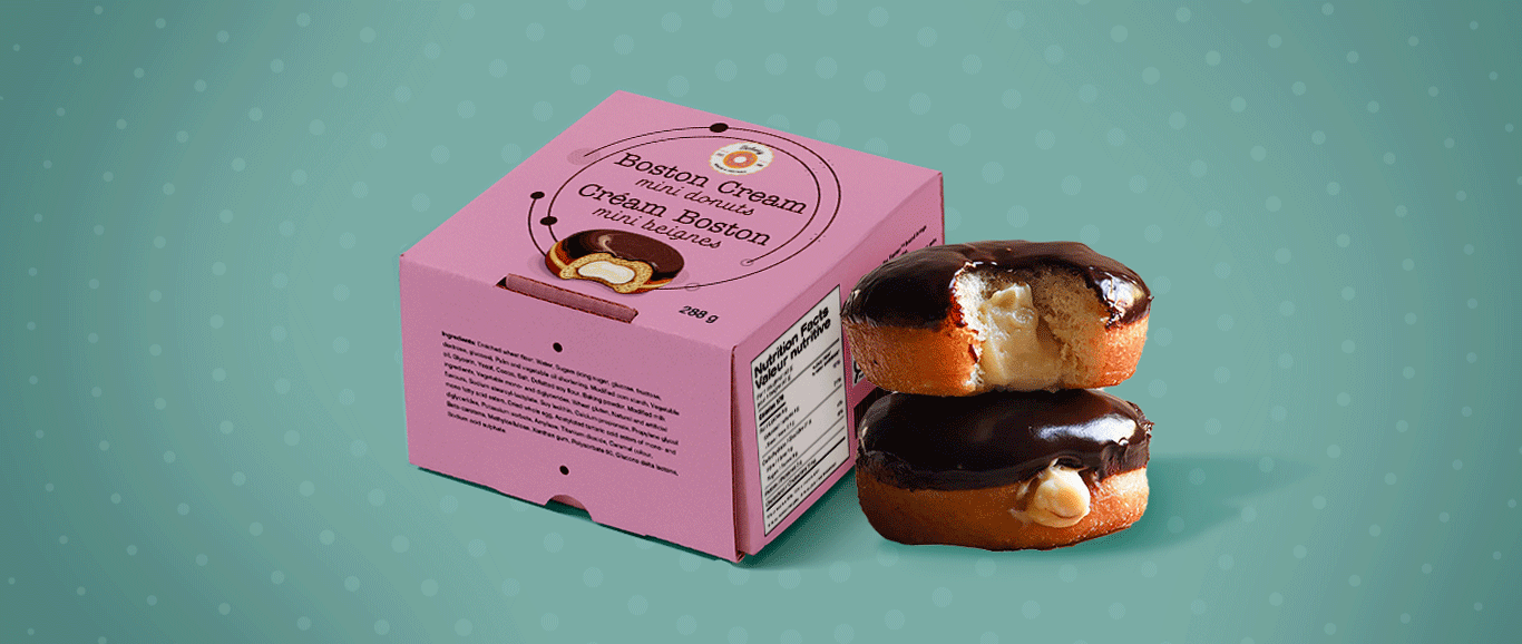
Everyday Classic
Audience: Modern, minimal shoppers
Design Intent: Clean and honest, focusing on the product’s comfort appeal.
Visual Approach:
-
Dusty pink and teal tones
-
Simplified layout and typography hierarchy
-
Authentic donut imagery with soft drop shadows
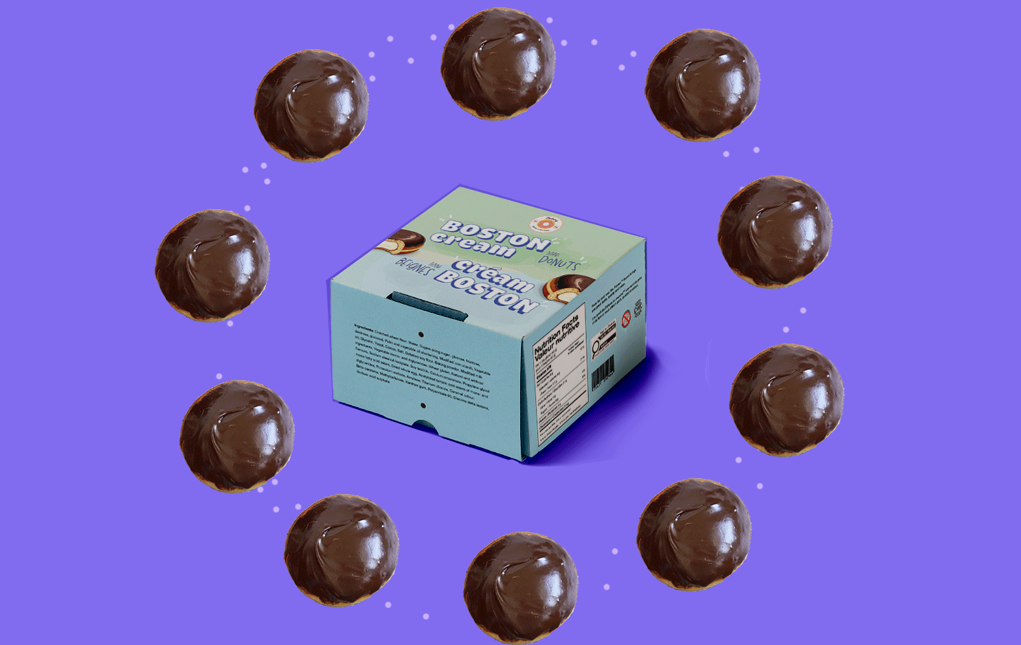
Playful Delight
Audience: Families and kids
Design Intent: Make it feel cheerful, energetic, and irresistibly fun.
Visual Approach:
-
Bright background colors and rounded typography
-
Floating donuts in motion for a lively rhythm
-
Contrast between minty pastels and chocolate tones
Result
A single product translated into three distinct identities — each visually coherent yet emotionally unique.
This exploration highlights how design can guide audience perception without altering the core product story.
Reflection
This project reminded me why I love packaging design — it’s storytelling in three dimensions. Every curve, color, and type choice builds an emotional bridge between the brand and its buyer.
My creative process is rooted in curiosity, empathy, and experimentation — exploring not just what looks good, but what feels right.